LOGO, BRANDING
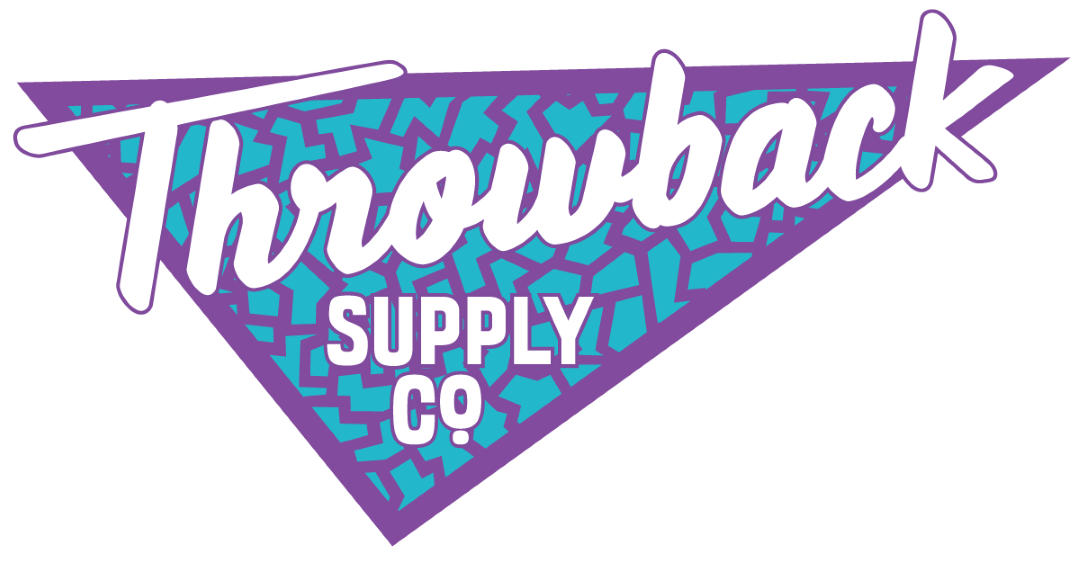
When we were approached for the initial pitch for what ended up being Throwback Supply Co., the pitch was early 90’s video game nostalgia, for a shop that offers a wide selection of old school video game consoles, games and accessories we wanted to deliver something bold to capture everything into a clean logo lockup.
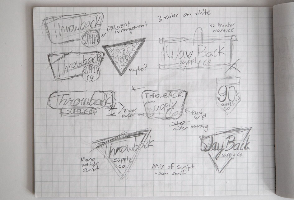
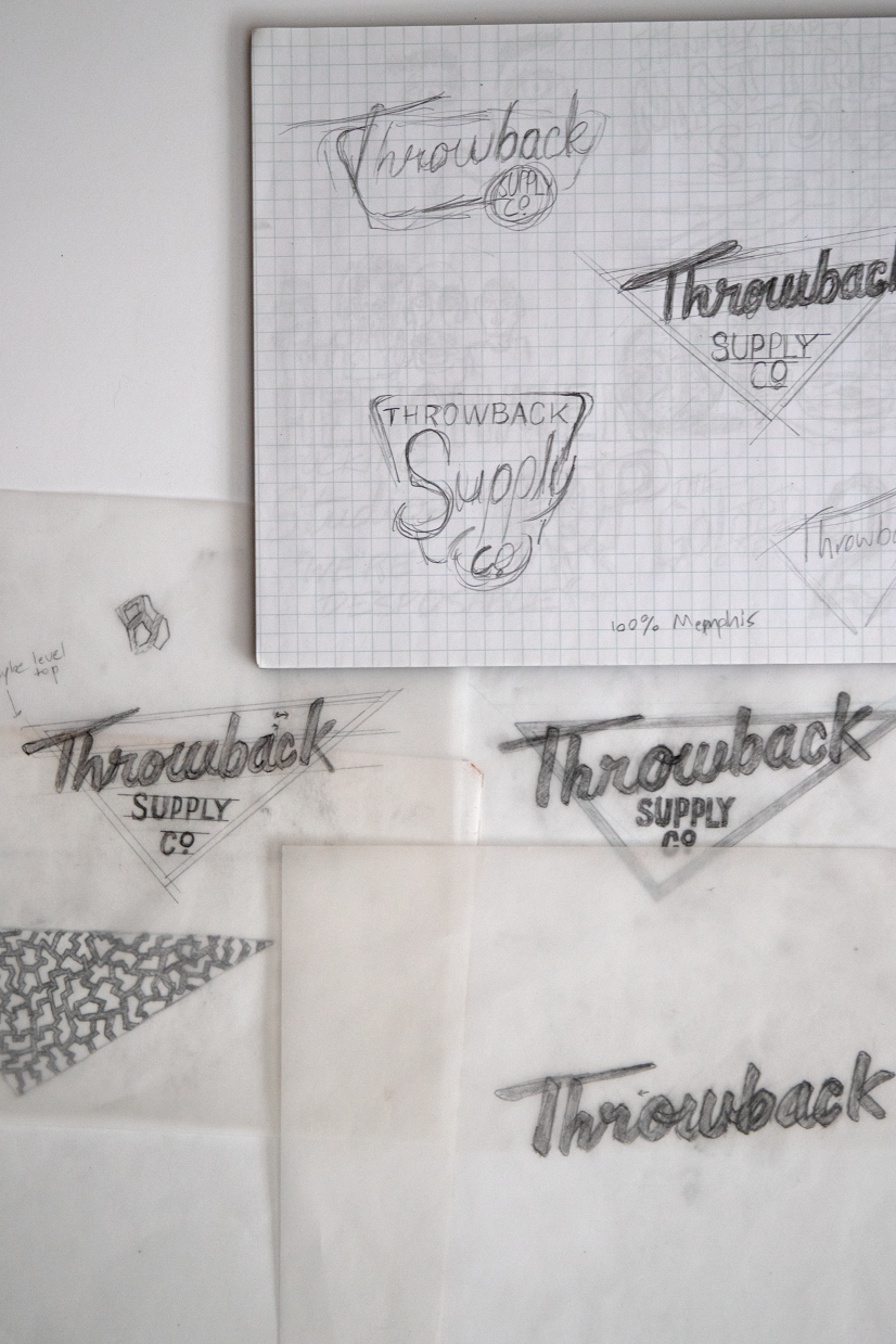
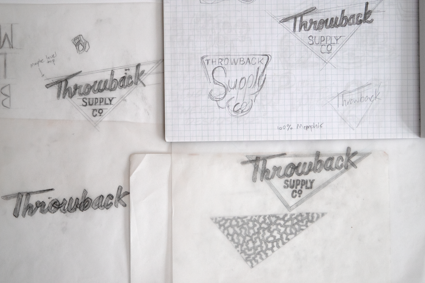
We dug through our archives of old ticket stubs, 80’s theme park reels, neon signs and full page ads for camper trucks to really hit the nail on the head for the execution of the project.
For the final design, we stuck with a simple two color design featuring some fun and casual script type to really give that early-90’s flare that was given in the brief. The fun color contrast with the white lettering won the contest with us before we knew it would win with the client (it did).
THROWBACK SUPPLY CO.
When we were approached for the initial pitch for what ended up being Throwback Supply Co., the pitch was early 90’s video game nostalgia, for a shop that offers a wide selection of old school video game consoles, games and accessories we wanted to deliver something bold to capture everything into a clean logo lockup.