
BRANDING, LOGO, PACKAGING, MERCH
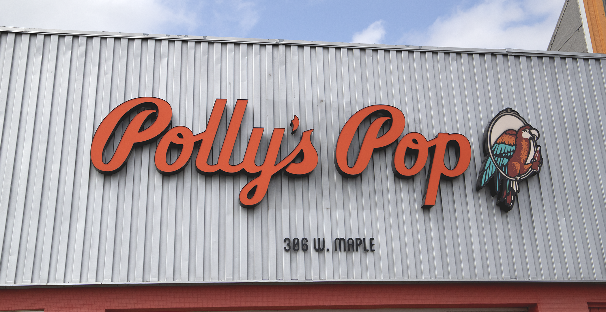
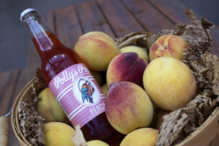
Originally founded in 1923 in Independence, Missouri, Polly’s Pop is a soda company that has once again become a staple in Kansas City.
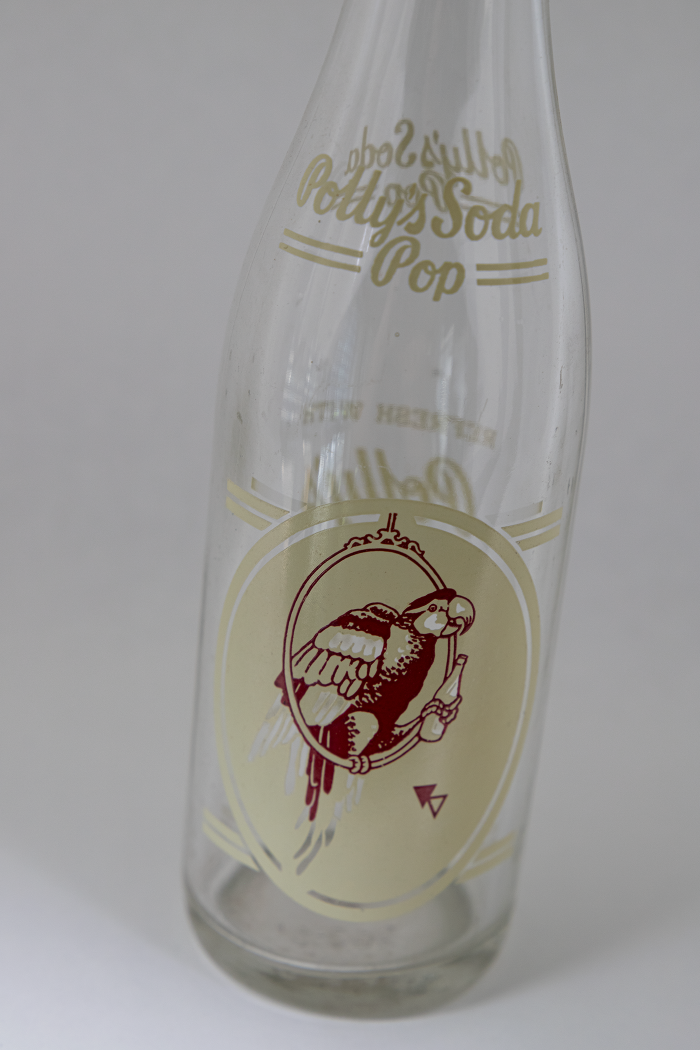
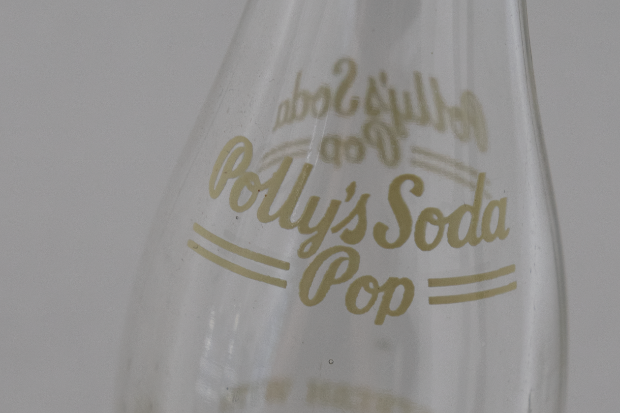
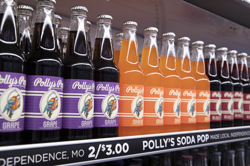
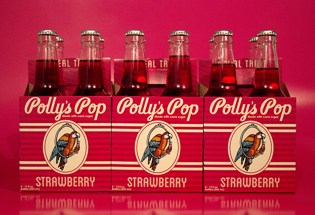
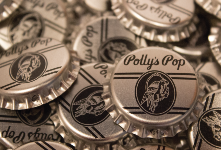
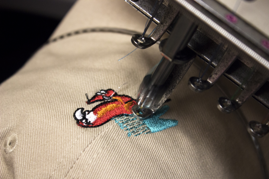
When starting the branding for Polly’s Pop, we wanted to incorporate as many of the elements from the original design and packaging which date back to 1923 when the company was founded. Some of the key takeaways that we wanted to keep were the logoscript that was on the neck of the bottles, the parrot in the ring with the bottle of cola in its claw, as well as the dual parallel lines at the top and bottom of the oval behind the parrot. We also wanted to incorporate that variety of color that the first run of Polly’s Pop utilized so well with their dozen plus soda flavors.
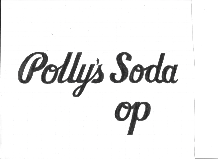
The first step to this process was to recreate the logoscript with pen and ink and then clean up the various inconsistencies within the weight of the lines. The other aspect was to recreate the bird in the ring digitally while incorporating the cream, red, orange and teal colors that often was used when painting the old Polly’s Pop logo onto coolers and other signage.
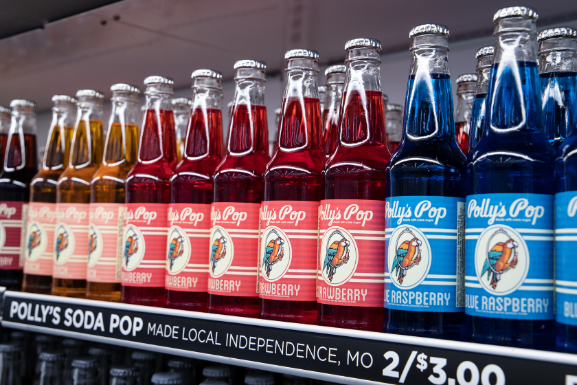
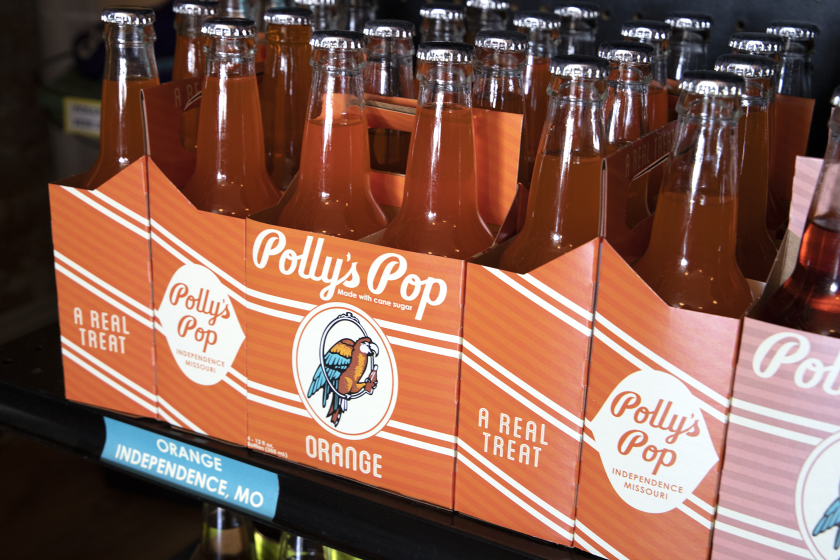
For the individual flavor designs, we wanted to incorporate the double parallel cream lines and oval from the original bottle design. To feature the lines as well as the individual flavor colors, we stimulated the color using multiple parallel lines alternating the primary flavor color with a lighter version of that same color every other row. This design allowed us to accentuate the cream lines within all 15 Polly’s Pop flavors.
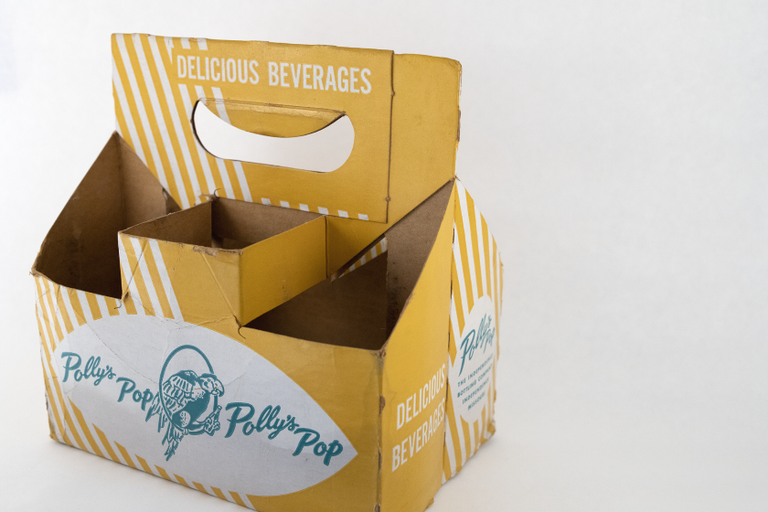
After the initial bottles were designed and put out into local grocery stores, the next project to follow suite was creating the individual flavor 4-packs. We knew that we wanted to continue to incorporate the parallel stripe design but also incorporate elements from the original 6-pack carrier such as the diagonal lines and byline about being made in Independence, Missouri. We incorporate the diagonal stripes that were featured in the original but by making them line up into each other so the packaging creates a seamless Möbius strip within the diagonal lines. This design makes it possible for the design to flow continuously, no matter how the carriers are arranged.
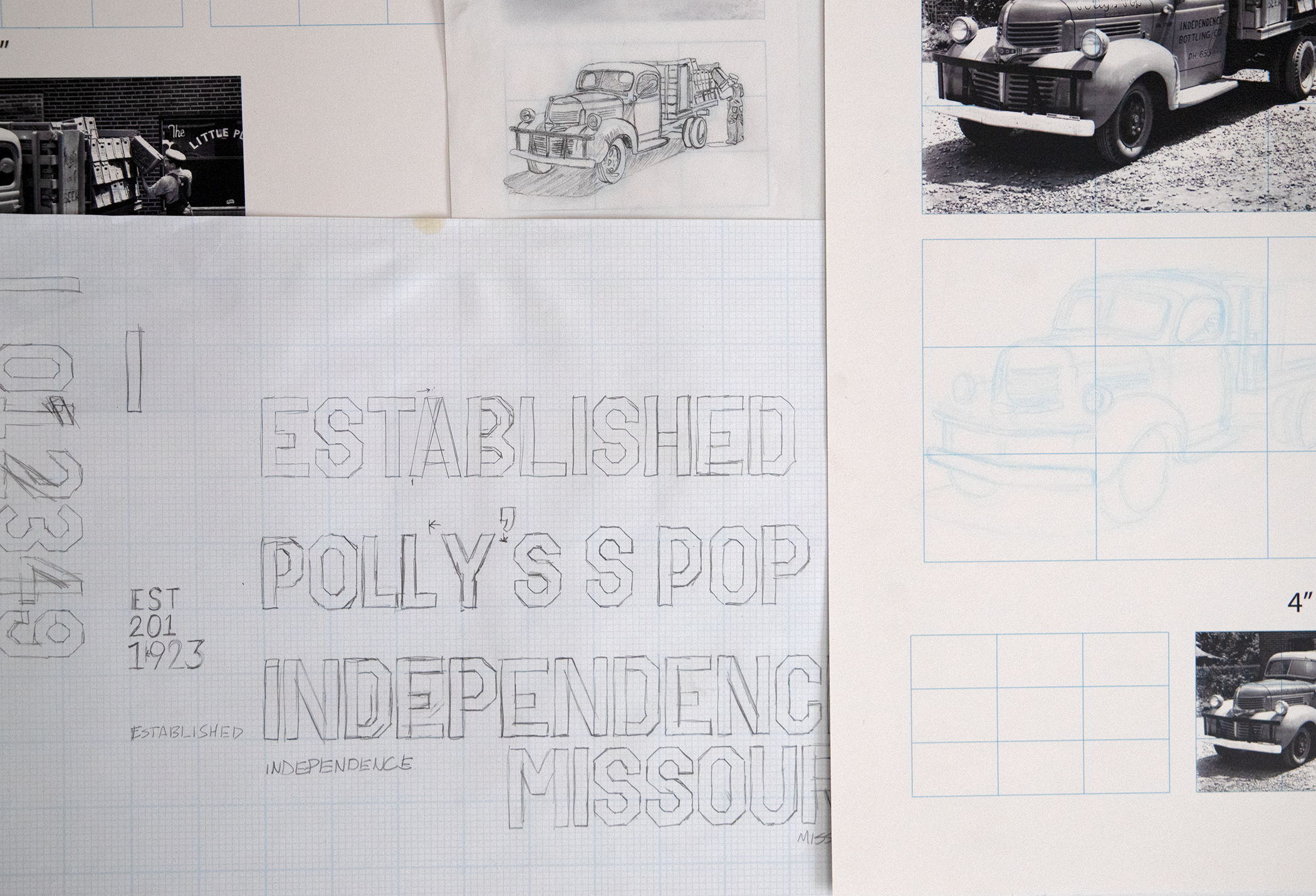
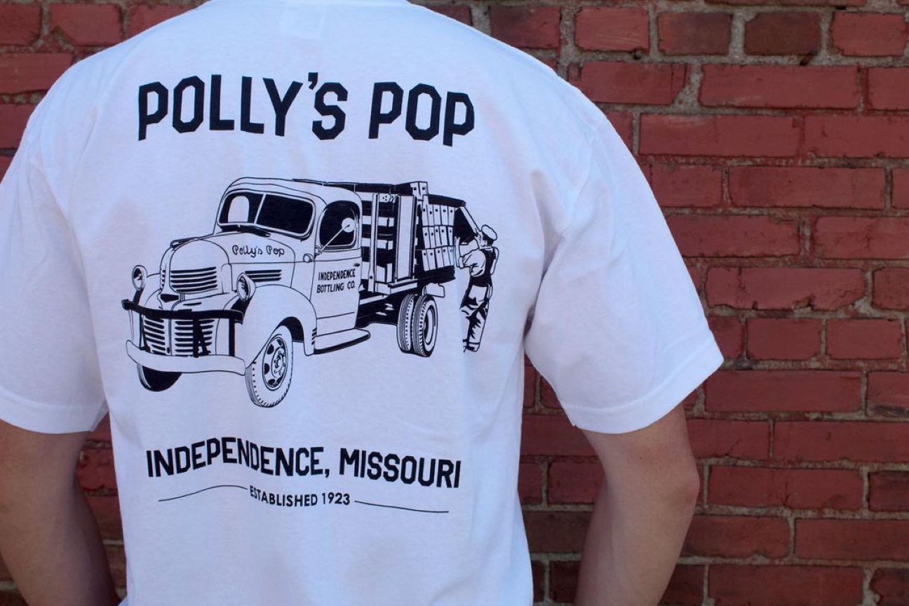
We’ve continued to put out many designs incorporating the rich history that Polly’s Pop offers, including designs and more custom typography into merchandise and other collateral and promotional material.
You can find Polly’s Pop at any grocery store in the Kansas City metro area among other specialty craft sodas.
POLLY'S POP
Originally founded in 1923 in Independence, Missouri, Polly’s Pop is a soda company that has once again become a staple in Kansas City.
When starting the branding for Polly’s Pop, we wanted to incorporate as many of the elements from the original design and packaging which date back to 1923 when the company was founded. Some of the key takeaways that we wanted to keep were the logoscript that was on the neck of the bottles, the parrot in the ring with the bottle of cola in its claw, as well as the dual parallel lines at the top and bottom of the oval behind the parrot. We also wanted to incorporate that variety of color that the first run of Polly’s Pop utilized so well with their dozen plus soda flavors.
The first step to this process was to recreate the logoscript with pen and ink and then clean up the various inconsistencies within the weight of the lines. The other aspect was to recreate the bird in the ring digitally while incorporating the cream, red, orange and teal colors that often was used when painting the old Polly’s Pop logo onto coolers and other signage.
For the individual flavor designs, we wanted to incorporate the double parallel cream lines and oval from the original bottle design. To feature the lines as well as the individual flavor colors, we stimulated the color using multiple parallel lines alternating the primary flavor color with a lighter version of that same color every other row. This design allowed us to accentuate the cream lines within all 15 Polly’s Pop flavors.